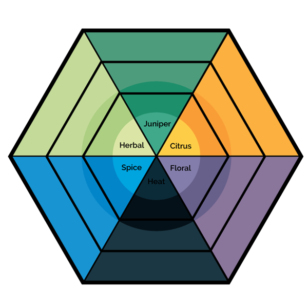
The first version of the GIN FLAVOR DIAGRAM was released in 2012 on THE GIN IS IN to help describe the flavor of gins that were being reviewed in the terms that consumers themselves used. In the time since it’s released I’ve continued researching and talking to consumers. In 2016 we added a new category, “herbal” to describe the emerging category of herb-forward gins that were being released.
The big finding was that consumers weren’t as motivated by simple ratings or scores— but instead were looking for gins with similar flavors to other gins that they liked. Before the diagram, a consumer going to the store looking for a gin that tasted like Hendrick’s or Gordon’s would have been baffled. Today, they have the tools to make smarter decisions. And distillers have better tools to release products to meet those needs.
